This article offers an in-depth guide on What is Pie Chart in Statistics. For readers seeking a comprehensive understanding, continue reading for detailed insights, practical examples, and expert advice.
In statistics and data analysis, showing information clearly is very important. One of the most common and easy-to-recognize charts used for this is the pie chart. But what is pie chart in statistics? A pie chart is a round chart divided into slices. Each slice shows a part of the total data. The size of each slice tells us how big or small that part is compared to the whole. This makes it easy to compare different categories.

In this article, we’ll explain in simple words what is pie chart in statistics, why it is useful, how to make one, real-life examples, when not to use it, and more. Whether you are a student, data analyst, or marketer, learning how to use pie charts can help you share information in a better way.
Let’s explore it together!
Table of Contents
What is Pie Chart in Statistics?
A pie chart in statistics is a type of graph that is shaped like a circle and is divided into slices. Each slice represents a portion of the total data. The size of each slice shows how much that part contributes to the whole.
For example, let’s say you surveyed 100 people about their favorite social media platforms:
- 50 like YouTube
- 30 like Instagram
- 15 like Facebook
- 5 like Twitter
This data can be shown in a pie chart where:
- YouTube slice is 50% of the circle
- Instagram is 30%
- Facebook is 15%
- Twitter is 5%
This way, you can easily see that YouTube is the most popular and Twitter is the least.
This is the core idea behind what is pie chart in statistics—it is a visual tool used to show parts of a whole.
Types of Pie Charts in Statistics
- Standard Pie Chart: A regular circle divided into slices based on data.
- Exploded Pie Chart: One slice is pulled out to highlight it.
- 3D Pie Chart: A pie chart with a 3D look for visual effect.
- Doughnut Chart: A pie chart with a hole in the middle.
- Nested Pie Chart: A doughnut chart with multiple rings to show levels.
- Variable Pie Chart: A chart where both slice size and thickness vary.
Why Are Pie Charts Important?
To understand what is pie chart in statistics, it’s also important to know why they are used.
Here’s why pie charts are popular:
- They are simple and attractive. Even people who don’t like numbers can understand them easily.
- They save time. In a single picture, you can understand which part is largest or smallest.
- They help compare data easily. You can quickly compare the sizes of different categories.
- They are great for presentations. They look clean, colorful, and professional.
Pie charts are commonly used in school projects, business presentations, government reports, news channels, and blogs because they give fast and clear answers.
How to Create a Pie Chart Manually
Here’s a simple way to create a pie chart, step by step:
1. Collect the Data
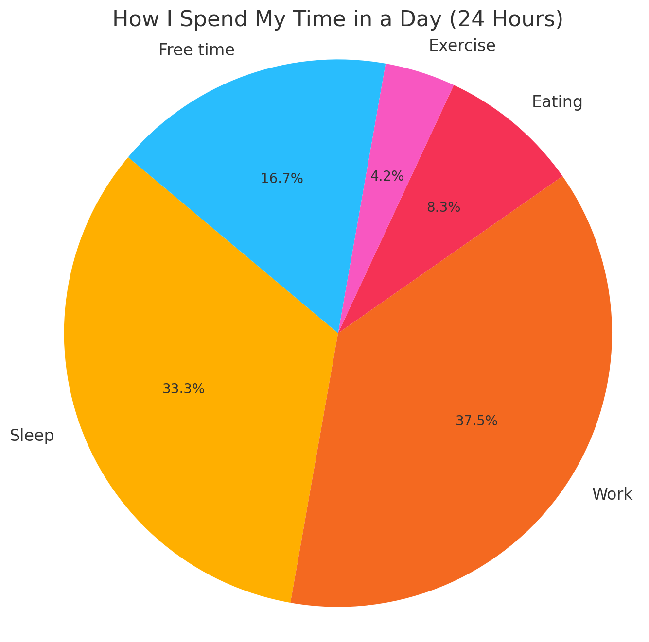
Let’s say you’re tracking how I spend my time in a day (24 hours):
- Sleep: 8 hours
- Work: 9 hours
- Eating: 2 hours
- Exercise: 1 hour
- Free time: 4 hours
2. Calculate the Total
Total = 8 + 9 + 2 + 1 + 4 = 24 hours
3. Convert to Percentages
- Sleep: (8/24) × 100 = 33.33%
- Work: (9/24) × 100 = 37.5%
- Eating: (2/24) × 100 = 8.33%
- Exercise: (1/24) × 100 = 4.17%
- Free time: (4/24) × 100 = 16.67%
4. Convert to Angles (Optional for manual drawing)
Multiply each percentage by 360° (since a circle has 360 degrees):
- Sleep: 33.33% × 360 = ~120°
- Work: 37.5% × 360 = ~135°
- And so on…
5. Draw the Chart
- Draw a circle
- Use a protractor or a tool to divide it into slices
- Label each slice clearly
5+ Best Pie Chart Maker Tools
Here are 5+ powerful pie chart maker tools that help you present statistics clearly and effectively.
1. Microsoft Excel
Microsoft Excel is one of the most popular spreadsheet tools, offering built-in functionality to create various charts, including pie charts. It is suitable for those who need to create quick and accurate visualizations without needing design or coding skills.
Key Features:
- Easy pie chart creation with just a few clicks
- Automatic calculations of percentages and angles
- Chart customization (colors, labels, 3D effects, legends)
- Integration with financial, statistical, or marketing datasets
- Printable and exportable for presentations or documents
2. Google Sheets
Google Sheets is a free and cloud-based spreadsheet tool similar to Excel. It allows users to create and edit pie charts directly in the browser with real-time collaboration.
Key Features:
- User-friendly chart editor
- Dynamic data updates (charts adjust automatically when data changes)
- Sharing and embedding options for websites and reports
- Export to PDF, PNG, or link format
- Cloud-based, accessible from any device
3. Python (Matplotlib & Seaborn Libraries)
For those who work with data regularly, Python libraries like matplotlib and seaborn offer powerful options to create pie charts programmatically. These tools are ideal for automating chart generation, integrating with data analysis pipelines, and customizing output to fit specific use cases.
Key Features:
- Full control over data, chart design, and interactivity
- Scripted chart generation for large or dynamic datasets
- Can be combined with pandas and numpy for advanced analytics
- Generates charts as image files or displays them in web apps or dashboards
4. Canva
Canva is a graphic design platform that provides an intuitive drag-and-drop interface for creating visual content. It includes chart templates and customization options, making it ideal for creating pie charts that are both informative and visually appealing.
Key Features:
- Pre-built chart templates
- Easy color and text customization
- Ability to add icons, images, and background designs
- Export charts in PNG, JPG, and PDF formats
- Great for adding charts into blog posts, infographics, and presentations
5. ChartGo
ChartGo is a free online tool designed for fast pie chart creation. It’s suitable for quick projects or when you need to generate a simple chart without installing any software.
Key Features:
- No account needed
- Simple form-based data entry
- Generates pie, bar, and line charts
- Instant download or embed code for websites
- Ideal for quick one-time use or basic presentations
6. Datawrapper
Datawrapper is a professional online chart-making tool often used by newsrooms, data journalists, and researchers. It supports interactive, responsive charts that can be embedded directly into websites and reports.
Key Features:
- Clean, mobile-responsive pie charts
- Support for large datasets
- Custom color palettes and font styles
- Easy to embed in articles, dashboards, or presentations
- Export as image or interactive iframe
Who Uses Pie Charts
Let’s look at how pie charts are used in everyday life:
| Field | Use Case Example |
|---|---|
| Education | Student marks distribution in subjects |
| Business | Company’s revenue breakdown by product/service |
| Finance | Monthly expenses distribution |
| Government | Budget spending by department |
| Marketing | Customer feedback percentages |
| Healthcare | Age or gender distribution of patients |
Benefits of Using Pie Charts
- Easy to understand: Even a child can read a well-labeled pie chart.
- Visual impact: A pie chart grabs attention and makes data memorable.
- Quick insights: You can instantly spot which category is largest or smallest.
- Great for presentations: Especially when showing simple comparison data.
FAQs:)
A. No. Use line graphs or bar charts for time-based trends.
A. Categorical data like sales by region, expenses by category, or votes by candidate.
A. Not really. Too many slices make them confusing. Use bar charts instead.
A. Only if they’re well-designed and properly labeled.
A. Pie charts are best for categorical data where the values represent parts of a whole, especially in percentages.
A. No, pie charts are not suitable for time series. Use line charts or bar graphs instead.
A. Preferably not more than five or six. Too many categories reduce clarity and readability.
A. They are visually effective but not ideal for comparing values with small differences. Use bar charts for higher accuracy.
Conclusion:)
Now you know what is pie chart in statistics, how it works, when to use it, and how to make it. It is a simple, clear, and effective way to show how data is divided into parts. Whether you’re explaining a school project, analyzing your budget, or presenting a business report, a pie chart can make your information easy to understand.
But remember, use pie charts only when your data adds up to 100% and has few categories. Keep the design clean and clear, and your audience will thank you for making the numbers easy to digest.
Read also:)
- What is Data Visualization in Python: A Step-by-Step Guide!
- Top 10 Best BI Tools for Startups: Unlock the Power of Data!
- How to Learn Data Science in India: A Step-by-Step Guide!
If you found this article helpful or have any questions about using pie charts, feel free to leave a comment below. We’d love to hear your thoughts and help you further!