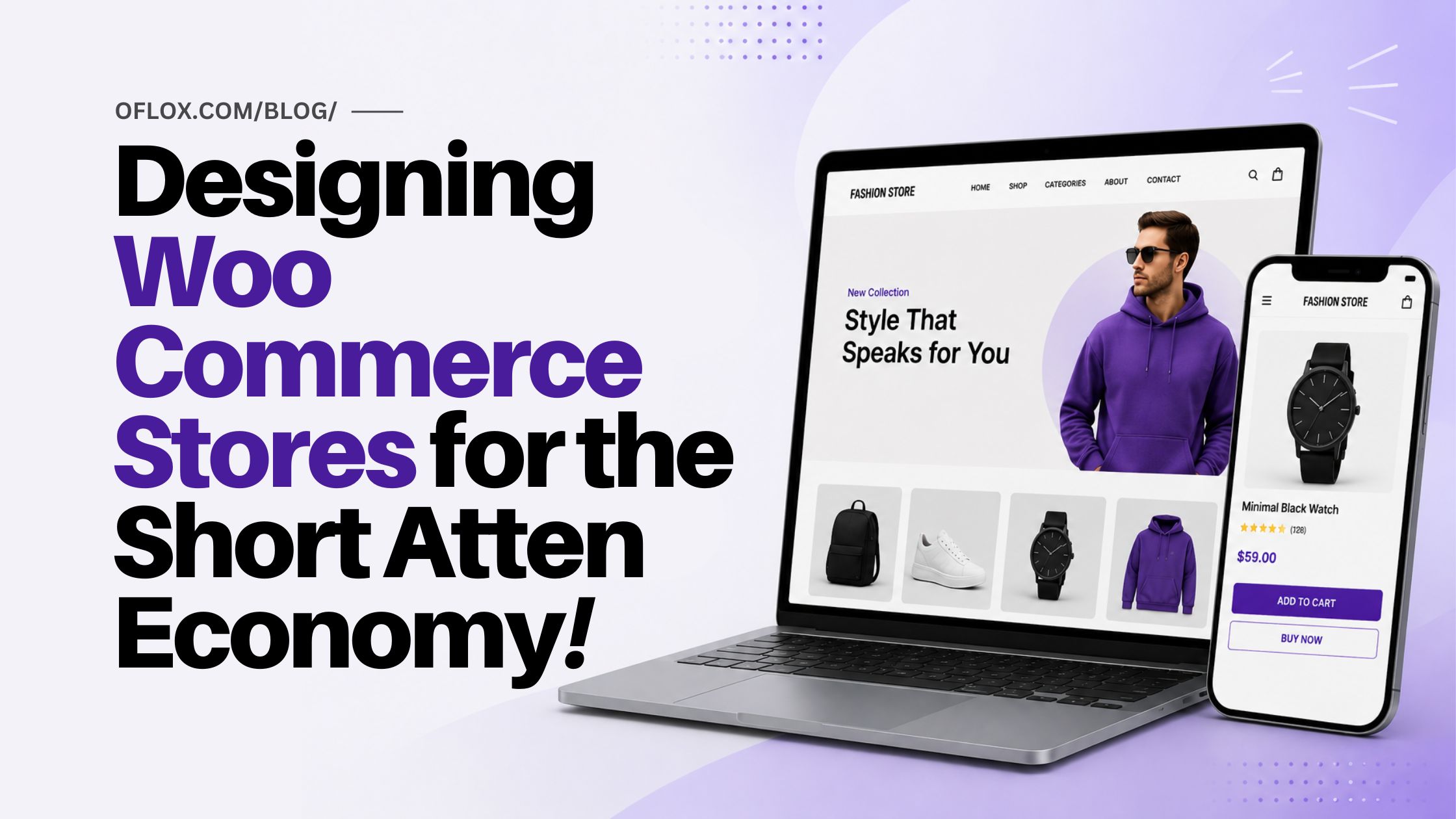
This article provides a detaild guide on designing modern Designing WooCommerce Stores for the Short Attention Economy. In 2026, online shoppers no longer spend several minutes exploring websites before making decisions. Instead, they scan pages within seconds and decide almost instantly whether they trust a store or not. That is why WooCommerce store design has become more important than ever before.
A successful WooCommerce website is no longer just about adding products and beautiful colors. Modern eCommerce design focuses on speed, simplicity, mobile responsiveness, fast navigation, visual hierarchy, and frictionless checkout experiences. If visitors feel confused, overwhelmed, or delayed, they simply leave the store and move to another website.
This article explores how businesses can design WooCommerce stores that capture attention quickly, improve user experience, increase conversions, and build customer trust in the modern digital shopping era. From homepage structure to product page optimization, navigation, mobile UX, and conversion-focused layouts — every important factor is covered in a beginner-friendly and professional way.
Whether you are a startup, D2C brand, online fashion store, electronics seller, or service-based business using WooCommerce, this guide will help you understand how attention-driven eCommerce design works and why it matters for online growth in 2026 and beyond.
Let’s explore it together!
Table of Contents
The New Reality of Online Shopping Attention
Online search has been transformed. Ten years ago, when a customer walked into a store, they were ready to spend time, explore, scroll through lengthy category pages, and read about products and detailed descriptions before reaching a final decision. That era is over. Today’s consumer expects to be “mid-scroll”, perhaps from a Facebook feed or a brief video that grabbed him for a few seconds and takes that impatient approach right into your store.
Now, it’s not minutes a new visitor waits before deciding to stay on a page, it’s seconds. They don’t read, they scan! They are not judging, they are feeling. Their brain is asking in those initial couple of seconds, ‘Is this a place where I can find what I’m looking for quickly, and trust that it will deliver? If the answer is ‘no’, not only in their minds once, but even before they have even thought about why, they’re gone.
This is not a bad news story for the owners of WooCommerce stores. It’s a challenge that has a lot of straightforward answers. Stores designed with this in mind, with the right WooCommerce development services in mind, convert at an astounding rate when compared to those that are still being designed for a patience that doesn’t exist anymore.
First Impressions Are Designed, Not Accidental
The error most store owners commit is to only consider visual design as decoration, that is, something to get right after the functional work. In the attention economy, design is function. The most important aesthetic considerations are conversion choices: the visual hierarchy of a page, the weight and location of a call to action, the visible text above the fold, the speed at which the first image appears, etc.
Nor is a homepage that welcomes visitors with a handful of products highlighted, rotating banners, a bunch of promotional text in three different fonts, and a navigation menu with twelve top-level options providing more choice for shoppers. It’s overloading them. The brain doesn’t know where to look and it makes the most convenient choice; which is to move on. The attention economy is not a place for simplicity. It’s a survival strategy to your store.
The best WooCommerce homepages don’t do much. They load quickly, clearly communicate the value proposition of the store in one sentence, have one primary call to action, and clearly let people know what the store is and for whom. All else is a secondary effect and for many, a better unsaid.
Each item you add to a page vying for attention with all other items. If more and more is added the individual item is increasingly not perceived.
Product Pages That Work in a Scanning Culture
It is at the product page that attention economy design becomes most critical, as it’s the final step prior to a purchasing decision. A shopper on a product page is not a shopper who is browsing, he is a shopper who is evaluating. They’re doing it fast, non-linearly and minimally with friction or ambiguity.
This implies that the most important information must be at the top of the page, without scrolling. The name of the product, a compelling picture, the price, and the main call to action (add to cart or buy now) should all be available on the first screen of the product that you encounter, on any device. Everything DOWN that fold is extra and needs to be arranged in a fashion that corresponds with the questions a shopper may be searching for when they scroll down to answer: sizing, materials, shipping, reviews, returns.
Long, lengthy product descriptions in paragraphs are not read word for word and word by word. Capsules of detail are scanned for and, if they can’t be found rapidly, either an uncertain purchase is made and returned or they go to another store where that detail is more clearly presented. Effective product page design is designed with these scan patterns and aims to structure content to meet those needs.
Navigation Designed for Impatience
Architecture of attention is navigation. Once they click two or three pages and still can’t find what they’re looking for, they will not continue to click. They will leave. That’s why it’s important that navigation design is given far greater consideration than most WooCommerce stores give it.
Most of the problems that occur in navigation are not technical problems, but conceptual. Stores plan their menus based on the nature of their organization, not what people consider when looking for products. The names of categories are very logical for those who wrote them, but not so logical for a visitor for the first time. Navigation labels should be trialed with a mental model of someone who has never been in the store, not the builder.
Search is also so important and often overlooked. Many customers, especially on mobile, click directly on the search bar without looking through the categories. They will be unable to consistently find a product by searching only the item title, which is a basic WooCommerce search feature. One of the most valuable improvements to the investing experience that a store can make is to invest in smarter search functionality, including handling synonyms, partial matches and product attributes. Professional Woocommerce development services consider search not the standard, but a main navigation option that requires special attention and configuration.
Speed as a Design Element
When people talk about the design of stores the speed is typically included in the performance discussion, not the design. The separation is wrong. When it comes to design from the visitor’s point of view in your store, it’s all about speed, the first thing they see before your pitch-perfect layout glides across their screen.
If it loads in two seconds or less, you’ll think it’s responsive and trustworthy. Having a store load in 4 or 5 seconds, even though it looks gorgeous when it loads, has already cost that small business a lot of visitors who navigated away before it loaded. Those aren’t incidental costs in the attention economy. They are most part of the opportunity, and it is finished before the experience starts.
This is why speed optimization is actually a design conversation, rather than a technical one! These include the images to load and the resolution, the fonts to serve and how many, the scripts to load now, and the deferring of certain scripts, all of these are design decisions with tremendous impact on performance. The top WooCommerce stores are created by teams that make these decisions collectively, keeping the customer’s first-second experience in mind.
Designing for the Decision, Not the Journey
The last paradigm change required by the attention economy designer is to see beyond the shopping trip and focus on the shopping decision. The traditional e-commerce path was focused on a path: browse, discover, explore, compare, decide. In that model patience and sequential behaviour was assumed. It’s been supplanted by something much more compacted in the attention economy: land, sense, decide.
In that squeezed down mindset, you’ll need to eliminate anything that is not actively helping the moment of sale. It involves creating the shortest route from landing to checkout possible from the product. It’s about making sure each page the customer interacts with, from a Google Shopping ad to the order confirmation, has one clear purpose and that purpose is executed without any distractions.
WooCommerce is flexible enough to be implemented in this kind of purposeful, decision centric design. Without direction, however, flexibility can produce the opposite; stores full of options, features, and content that are plentiful for those who create them, but daunting for the customers who come in. It’s the job of the experienced woocommerce development services to take this and turn it into a store that welcomes and retains attention in this environment and in 2026, it’s some of the most valuable work a growing store can invest in.
Conclusion:)
Modern WooCommerce success is no longer only about products or pricing. It is about attention. Businesses that capture attention quickly, reduce friction, simplify navigation, and guide decisions effectively are the ones winning in today’s competitive eCommerce industry.
The uploaded article explains that attention-focused WooCommerce design is not simply about aesthetics — it is about creating fast, purposeful, decision-driven shopping experiences. Businesses that adapt to this new reality can dramatically improve conversions, trust, customer retention, and overall online growth.
“The stores that win in 2026 will not be the loudest — they will be the clearest.” – Mr Rahman, CEO Oflox®
Read also:)
- Top 10 B2B eCommerce Marketplaces In 2026: A Complete Guide!
- 10+ Best eCommerce Shipping Software: A Quick A-to-Z Guide!
- What is Quick Commerce and eCommerce: A Complete Guide!
Have you tried improving your WooCommerce store for faster customer attention and better conversions? Share your experience or ask your questions in the comments below — we’d love to hear from you!